Tabs · Services
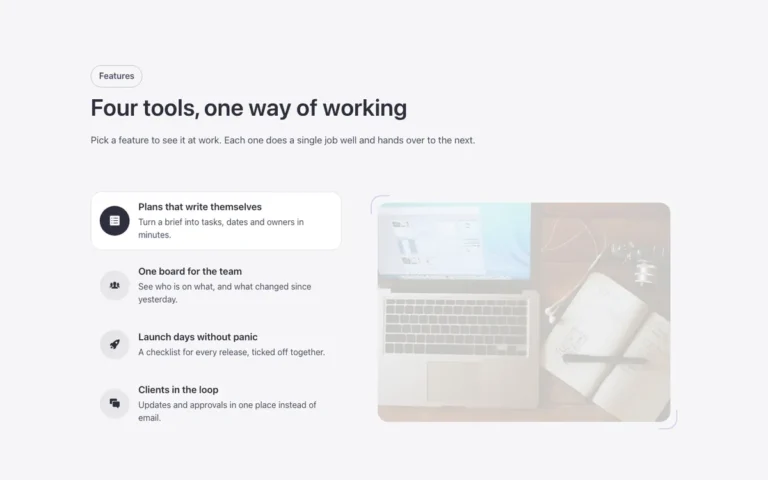
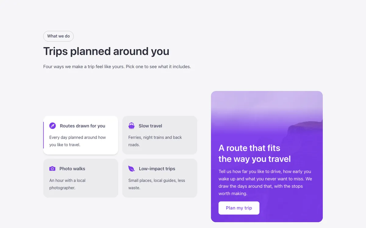
A services tabs section for Bricks Builder: a 2x2 grid of services, each with an icon, title and text, acts as the tabs, with the open one in white with a shadow and an accent bar. Beside it, the panel's photo opens from the center under a brand-colored layer, with the text and button entering after.
In the annual plan, $99/year. See plans
Uses a small script. Turn on Code execution in Bricks › Settings › Custom code. How to turn on Code execution
Preview
Loading demo…
Template details
What’s inside
The components it’s built from. They come with the template when you paste it, and you edit them from the Bricks panel.
- FBK Button
A link styled as a button, with style, size and width.
- FBK Intro
Eyebrow, title, lead and an actions slot for buttons.
Adjust it
Change these variables in Bricks to tune it; everything else follows your framework.
On the element Tabs, class fbk-tabservices
Length of the panel's entrance (photo, color, text)
- --fbk-t-in
- 0.9s
- --fbk-t-tab-bg
- var(--fbk-card-scheme-bg, var(--white))
Replaces
In Fancy Bricks 1.0 and 2.0 this was Tab services (1.0).