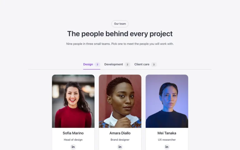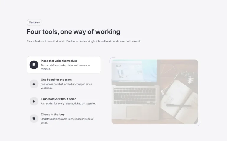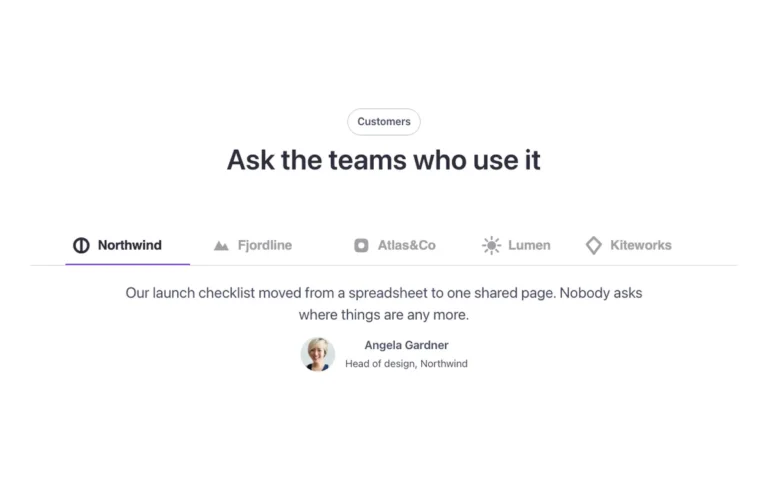
Header · Mega menu tabs
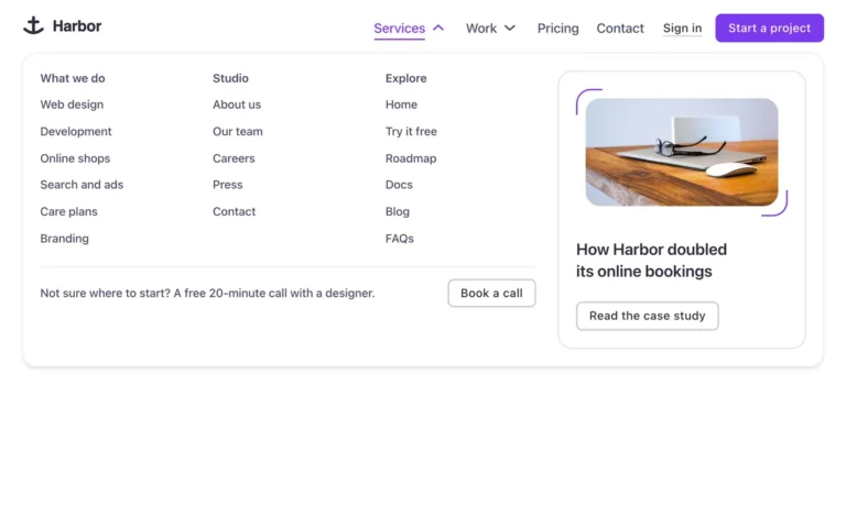
A header with a tabbed mega menu for Bricks Builder: logo, a dropdown with an explainer and two links, a mega menu built on the native Tabs element, and a login link plus a main button. Its categories sit in a vertical list on the left and open their content on the right on hover or with the arrow keys, each one built from FBK Menu card, while the panel itself opens as a circle that grows from the trigger.
In the annual plan, $99/year. See plans
Uses a small script. Turn on Code execution in Bricks › Settings › Custom code. How to turn on Code execution
Preview
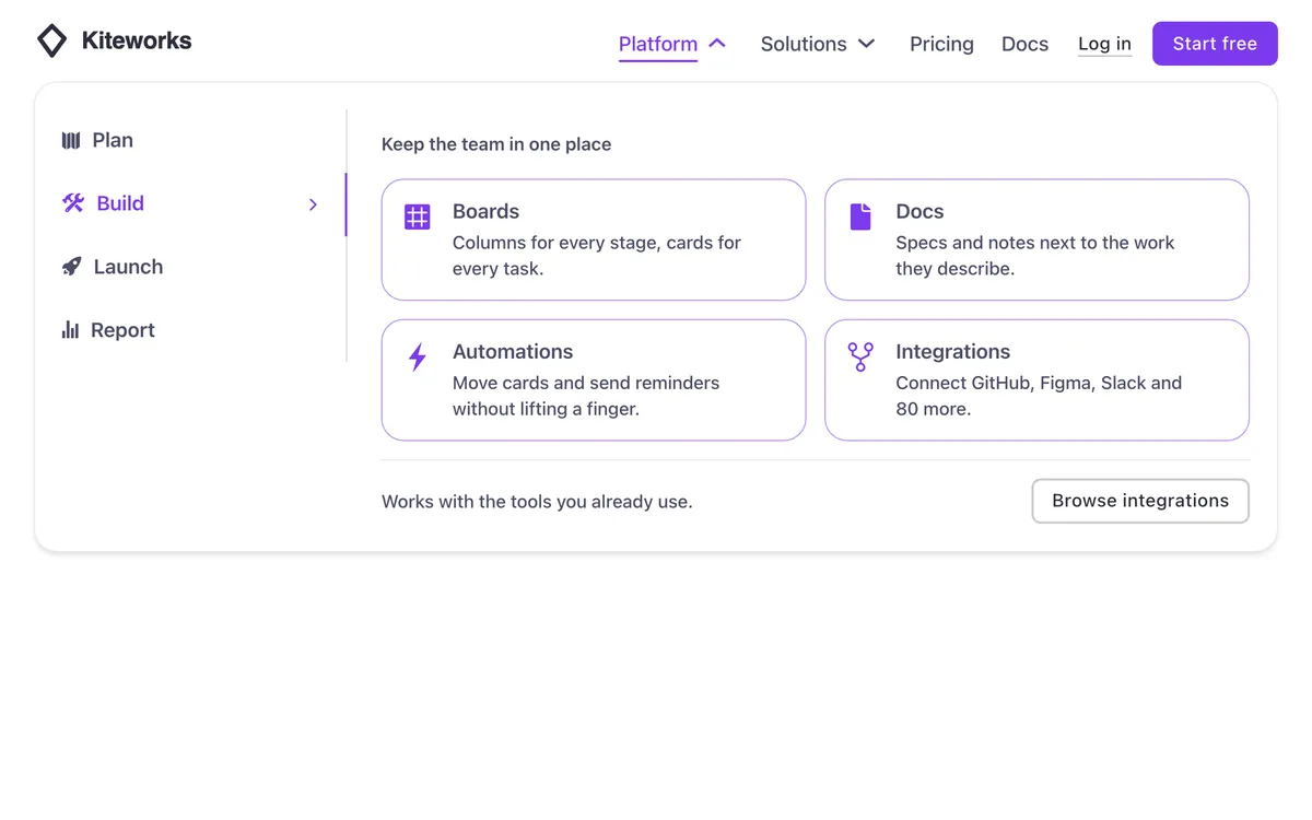
Loading demo…
Template details
What’s inside
The components it’s built from. They come with the template when you paste it, and you edit them from the Bricks panel.
- FBK Button
A link styled as a button, with style, size and width.
- FBK Header
The whole header: bar, logo, menu, actions and optional top/bottom slots.
- FBK Menu card
A linked card for mega menus: icon, title and a line of text.
Adjust it
Change these variables in Bricks to tune it; everything else follows your framework.
On the element Tabs, class fbk-hmtabs
Width of the category column
- --fbk-t-menu
- 14em