Process · Cycle
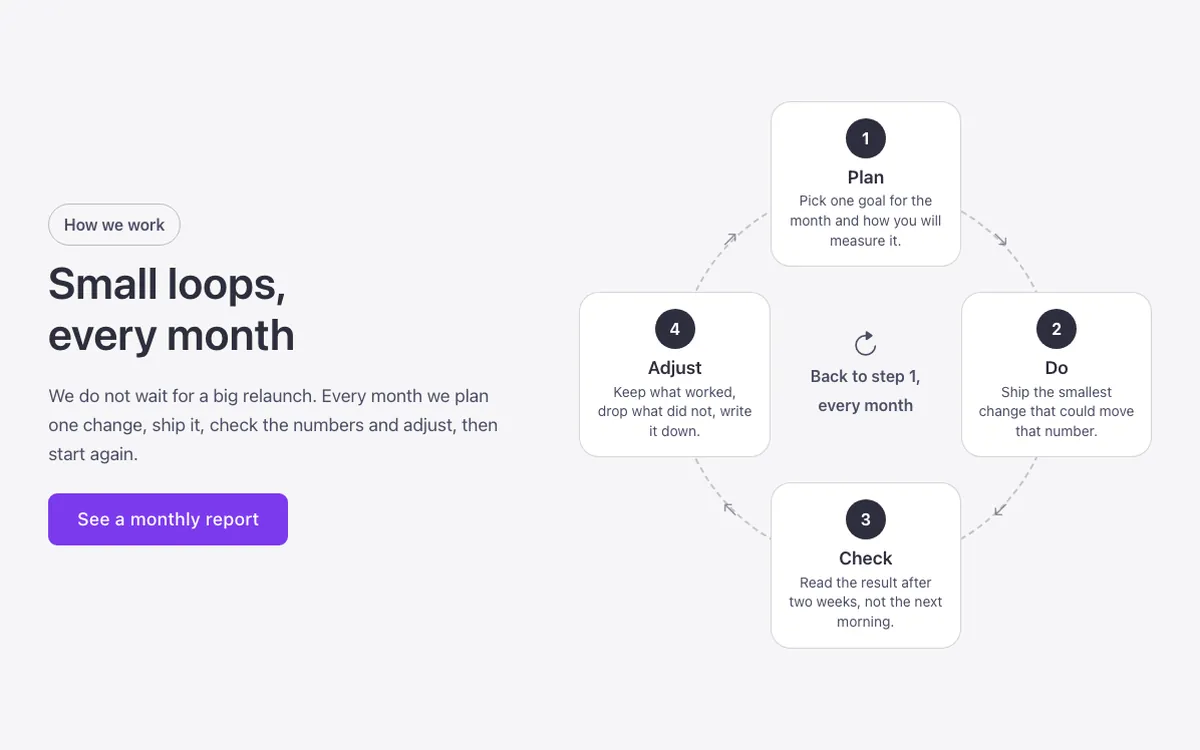
A four-step cycle diagram for Bricks Builder with steps placed around a dashed ring, clockwise arrows, and the cycle's motto in the center, good for continuous-improvement processes. Built on the FBK Intro component, so every step's title and text stay editable from the panel.
In the annual plan, $99/year. See plans
Preview
Loading demo…
Template details
What’s inside
The components it’s built from. They come with the template when you paste it, and you edit them from the Bricks panel.
- FBK Button
A link styled as a button, with style, size and width.
- FBK Intro
Eyebrow, title, lead and an actions slot for buttons.
Adjust it
Change these variables in Bricks to tune it; everything else follows your framework.
On the element Cycle, class fbk-wf-cycle
The ring: its line and color
- --fbk-t-ring
- color-mix(in srgb, currentColor 30%, transparent)
- --fbk-t-arrow
- color-mix(in srgb, currentColor 60%, transparent)
The steps' cards: white like every Outline surface (dark or brand with the section's scheme)
- --fbk-t-card-bg
- var(--fbk-card-scheme-bg, var(--white))