Cards · Downloads
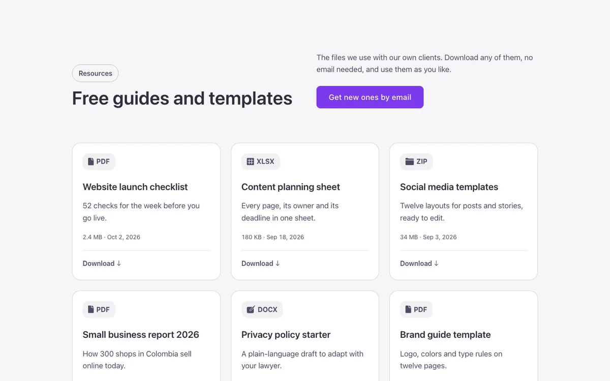
A downloadable resources grid for Bricks Builder: each card shows a file type badge with its icon, a title, size and date, and a «Download» link at the bottom with a growing arrow. Built with the FBK Card and FBK Card grid components, so file types and links stay editable from the panel.
In the annual plan, $99/year. See plans
Preview
Loading demo…
Template details
What’s inside
The components it’s built from. They come with the template when you paste it, and you edit them from the Bricks panel.
- FBK Button
A link styled as a button, with style, size and width.
- FBK Card
A media slot, title, text, a content slot and an actions slot.
- FBK Card grid
A grid that takes FBK Card or FBK Icon item instances, or a query loop.
- FBK Intro
Eyebrow, title, lead and an actions slot for buttons.
Adjust it
Nothing extra to set: it takes its colors, spacing and type from your framework.