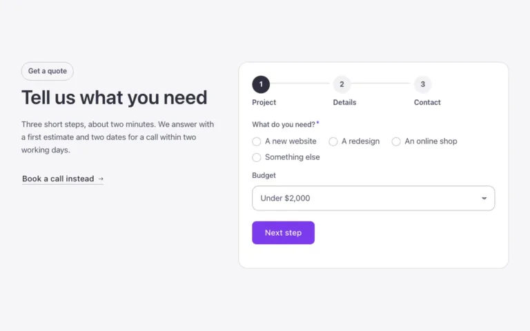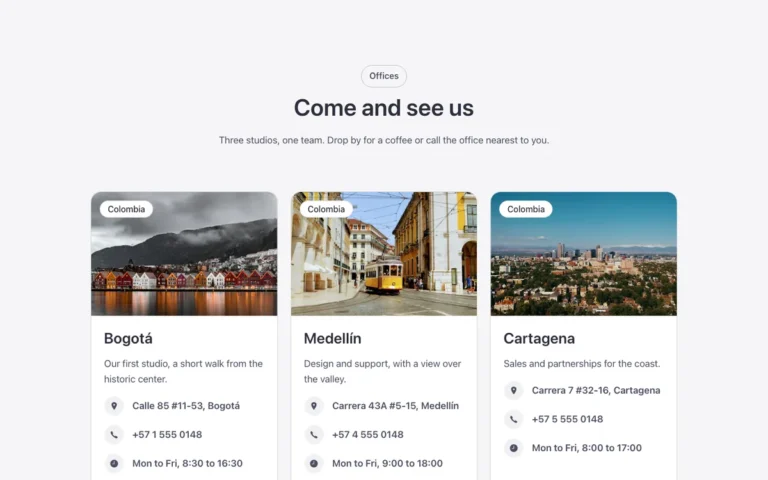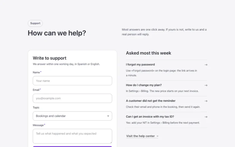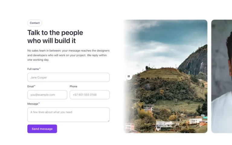
Contact · Split form
A split contact section for Bricks Builder: a rounded panel with the intro, contact details and social links on one side, and a Bricks form in a white card on the other. While you type, the form card lifts slightly and gains a deeper shadow, a removable touch built for every form in the library.
In the annual plan, $99/year. See plans
Preview
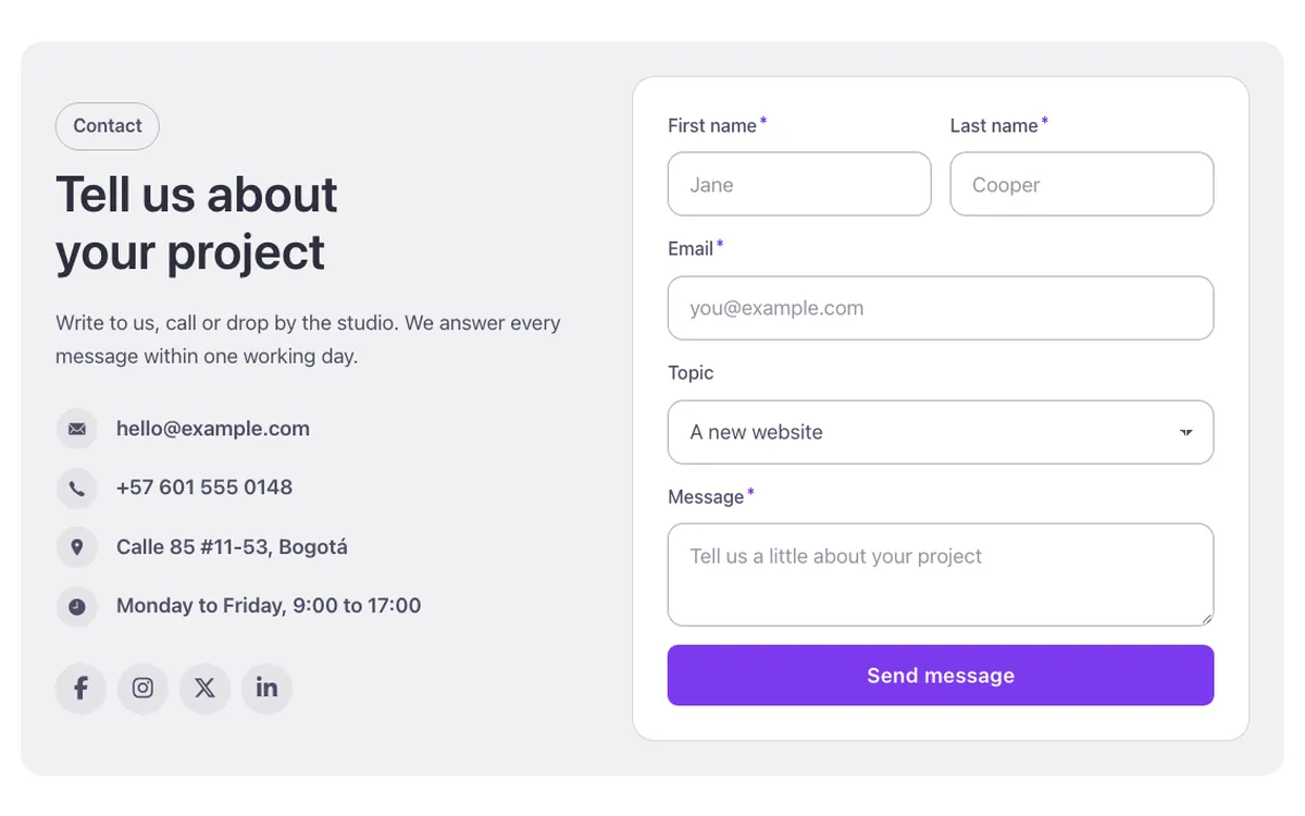
Loading demo…
Template details
What’s inside
The components it’s built from. They come with the template when you paste it, and you edit them from the Bricks panel.
- FBK Icon item
Icon, title and text, stacked, inline or boxed.
- FBK Intro
Eyebrow, title, lead and an actions slot for buttons.
- FBK Social
Links to your social profiles, logo and network name.
Adjust it
Change these variables in Bricks to tune it; everything else follows your framework.
On the element Contact panel, class fbk-splitform
Form card color: white like every Outline surface (dark or brand with the section's scheme)
- --fbk-t-form-bg
- var(--fbk-card-scheme-bg, var(--white))