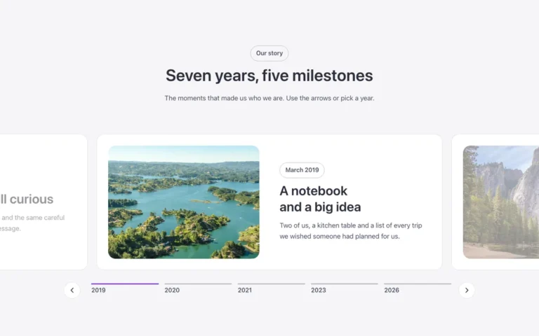
Card navigation slider
A navigation card slider for Bricks Builder: a full-width photo carries the text on the left, and on the right a row of photo cards, built on the FBK Card component, drives the slides as it plays on its own. The active card's photo grows to fill it while its text folds away, with the common pause button.
In the annual plan, $99/year. See plans
Uses a small script. Turn on Code execution in Bricks › Settings › Custom code. How to turn on Code execution
Preview

Loading demo…
Template details
What’s inside
The components it’s built from. They come with the template when you paste it, and you edit them from the Bricks panel.
- FBK Button
A link styled as a button, with style, size and width.
- FBK Card
A media slot, title, text, a content slot and an actions slot.
- FBK Intro
Eyebrow, title, lead and an actions slot for buttons.
Adjust it
Change these variables in Bricks to tune it; everything else follows your framework.
On the element Slider + cards, class fbk-cardnav
Height of the section's photo, height of the cards, and the dark layer over the photo
- --fbk-t-height
- clamp(36em, 48vw, 44em)
- --fbk-t-card-h
- clamp(17em, 22vw, 20em)
- --fbk-t-shade
- color-mix(in srgb, var(--base-ultra-dark) 65%, transparent)
- --fbk-t-edge
- var(--space-xl)
- --fbk-reveal-accent
- var(--primary-light)
- --fbk-slider-track
- var(--white)
Layout (changes below 767 px): the cards on the right half, at the bottom
- --fbk-t-nav-pos
- absolute
- --fbk-t-nav-w
- calc(50% - var(--space-l))
- --fbk-t-text-w
- 50%
- --fbk-cn-slide-end
- var(--space-xl)
The text at the bottom, level with the foot of the cards (phones: centered)
- --fbk-cn-justify
- flex-end
Replaces
In Fancy Bricks 1.0 and 2.0 this was Slider (1.0).