Card effects
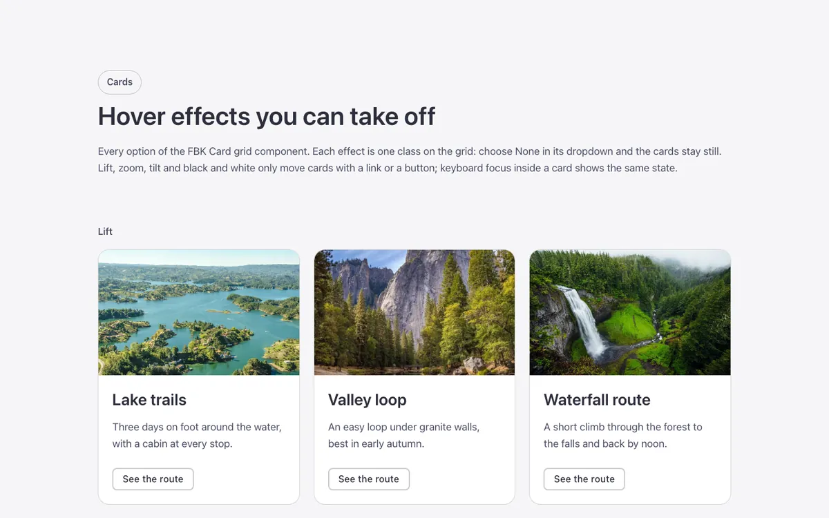
A showcase of hover effects for the FBK Card grid component in Bricks Builder: lift, photo zoom, 3D tilt, border light and text reveal, in light and dark, plus the FBK Flip card. Lift, zoom, tilt and black-and-white only move cards that carry a link or a button. Copy any card style you like.
In the annual plan, $99/year. See plans
Uses a small script. Turn on Code execution in Bricks › Settings › Custom code. How to turn on Code execution
Preview
Loading demo…
Template details
What’s inside
The components it’s built from. They come with the template when you paste it, and you edit them from the Bricks panel.
- FBK Button
A link styled as a button, with style, size and width.
- FBK Card
A media slot, title, text, a content slot and an actions slot.
- FBK Card grid
A grid that takes FBK Card or FBK Icon item instances, or a query loop.
- FBK Flip card
A card that turns over on hover or keyboard focus to show its back.
- FBK Intro
Eyebrow, title, lead and an actions slot for buttons.
Adjust it
Nothing extra to set: it takes its colors, spacing and type from your framework.