Logos · Press mentions
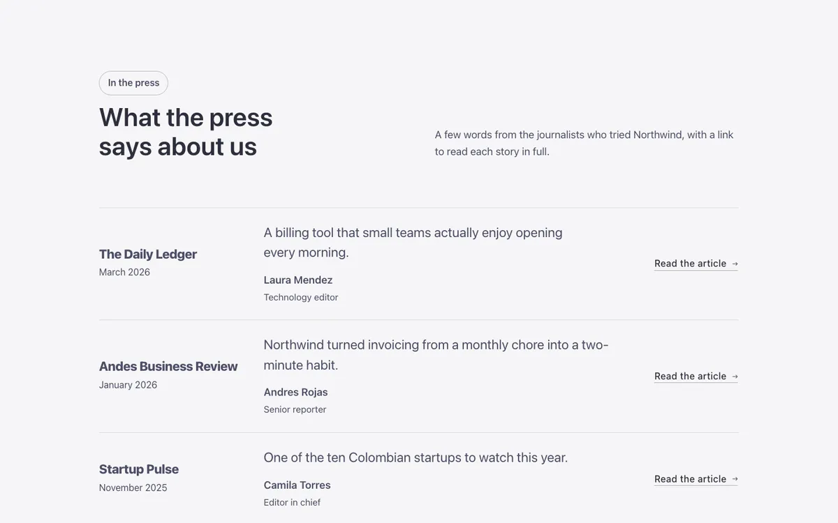
A functional press mentions section for Bricks Builder: rows separated by hairlines, each with a publication's name, a quoted line from its coverage built on the FBK Quote component, and a read the article link. Hovering a row tints it and colors the publication's name.
In the annual plan, $99/year. See plans
Preview
Loading demo…
Template details
What’s inside
The components it’s built from. They come with the template when you paste it, and you edit them from the Bricks panel.
- FBK Button
A link styled as a button, with style, size and width.
- FBK Intro
Eyebrow, title, lead and an actions slot for buttons.
- FBK Quote
A testimonial: quote, stars, avatar, name, role or company and date.
Adjust it
Change these variables in Bricks to tune it; everything else follows your framework.
On the element Press mentions, class fbk-wf-press
Width of the outlet column
- --fbk-t-outlet
- 14em
Row tint on hover and how far it reaches past the text at the sides
- --fbk-t-row-hover
- color-mix(in srgb, currentColor 5%, transparent)
- --fbk-t-row-pad
- var(--space-s)