Text media · Photo and icons
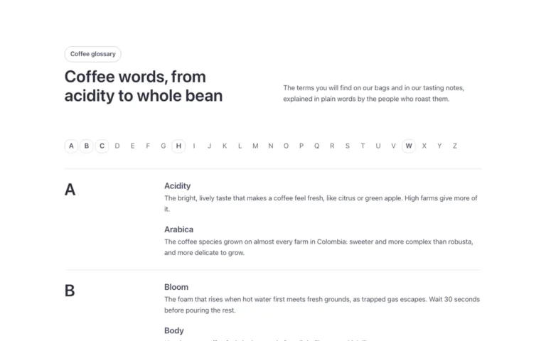
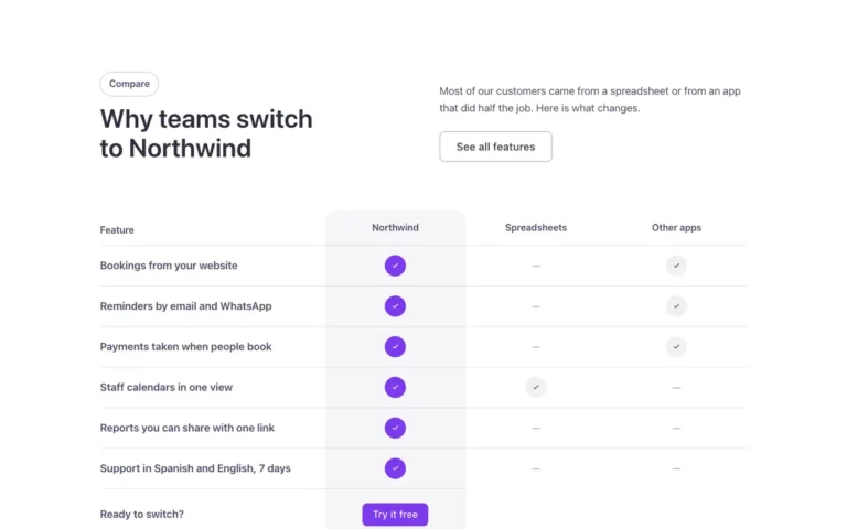
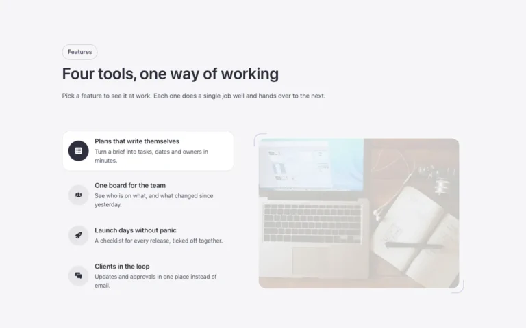
A text and media section for Bricks Builder in three columns: a text panel over a color block, a photo, and four points with icons. It is a simple way to pair a message with visuals and quick feature highlights.
In the annual plan, $99/year. See plans
Preview

Loading demo…
Template details
What’s inside
The components it’s built from. They come with the template when you paste it, and you edit them from the Bricks panel.
- FBK Button
A link styled as a button, with style, size and width.
- FBK Icon item
Icon, title and text, stacked, inline or boxed.
- FBK Image
A photo with proportion, shape, decoration, border and an optional caption.
- FBK Intro
Eyebrow, title, lead and an actions slot for buttons.
Adjust it
Change these variables in Bricks to tune it; everything else follows your framework.
On the element Text, photo and points, class fbk-mdicons
Color block behind the panel: its color and how far into the grid it reaches
- --fbk-t-band
- var(--primary)
- --fbk-t-band-w
- 20%
- --fbk-t-panel-bg
- var(--fbk-card-scheme-bg, var(--white))
Replaces
In Fancy Bricks 1.0 and 2.0 this was Content (1.0) and Content (2.0).