Pricing · Cards and comparison
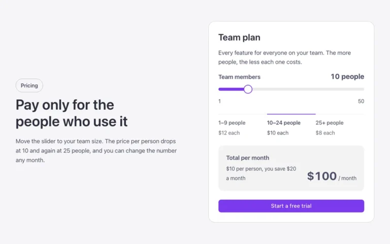
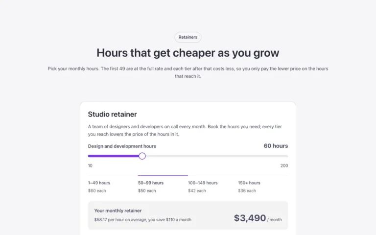
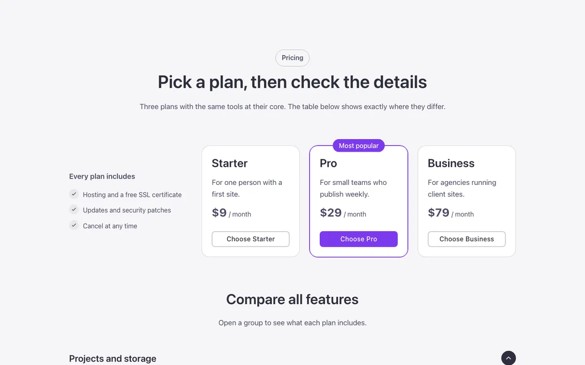
Three plan cards and a full feature comparison for Bricks Builder: the middle plan sits highlighted with an accent frame, and below it an FBK Accordion opens grouped feature tables whose columns line up with the cards above. Rows fade in one after another as each group opens, built without JavaScript.
In the annual plan, $99/year. See plans
Preview
Loading demo…
Template details
What’s inside
The components it’s built from. They come with the template when you paste it, and you edit them from the Bricks panel.
- FBK Accordion
Drop FBK Accordion items, or a query loop, into the Items slot.
- FBK Accordion item
One question or step of an FBK Accordion.
- FBK Button
A link styled as a button, with style, size and width.
- FBK Card
A media slot, title, text, a content slot and an actions slot.
- FBK Check item
One row of an FBK Check list: the house check mark and a short text.
- FBK Check list
A list of checks in the Fancy Bricks style families.
- FBK Intro
Eyebrow, title, lead and an actions slot for buttons.
- FBK Price
A price: currency, a large figure, a period, an optional old price and a note.
Adjust it
Change these variables in Bricks to tune it; everything else follows your framework.
On the element Pricing, class fbk-pcards
Columns shared by the plans and the comparison tables: the label column, then one per plan
- --fbk-t-cols
- minmax(0, 1.25fr) repeat(3, minmax(0, 1fr))
Featured plan: frame color, and the tint that runs down its column in the tables
- --fbk-t-accent
- var(--primary)
- --fbk-t-tint
- color-mix(in srgb, var(--base-ultra-dark) 7%, transparent)
The line between table rows, and the dash for features not included
- --fbk-t-line
- color-mix(in srgb, currentColor 12%, transparent)
- --fbk-t-no
- color-mix(in srgb, currentColor 55%, transparent)
Gap between the rows of the included-features list
- --fbk-checks-gap
- 0.625em
How long each row takes to come in when a group opens
- --fbk-t-row-time
- var(--fbk-hover)