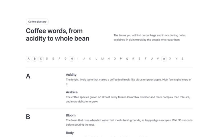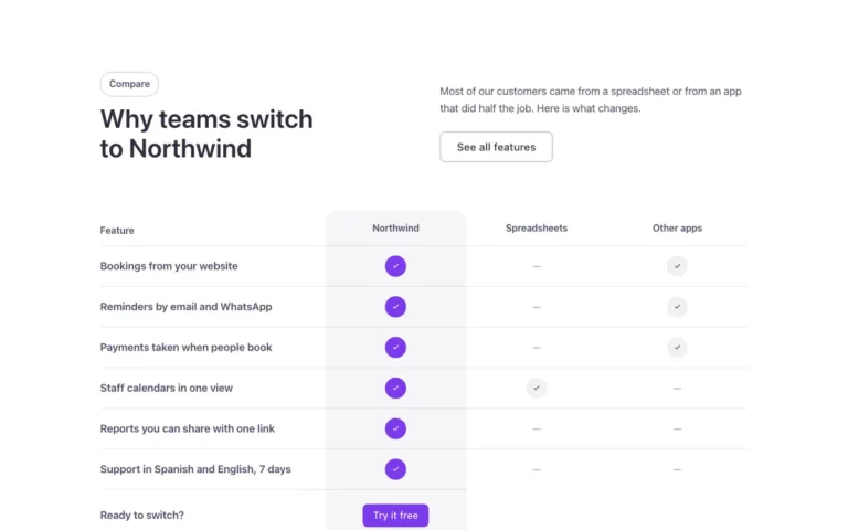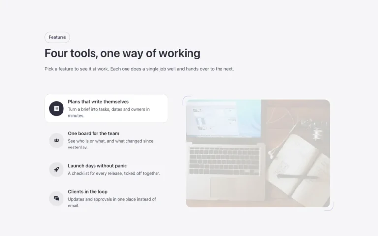
Features · Compare
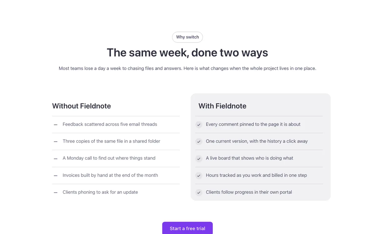
A side-by-side comparison for Bricks Builder: a left column with the old way of working, struck through, and a right column with the same task done your way, its checkmarks sitting on a soft brand surface that spans the whole column. Point at a row and the old line fades out while the matching check fills in, so each problem lines up with its answer.
In the annual plan, $99/year. See plans
Preview
Loading demo…
Template details
What’s inside
The components it’s built from. They come with the template when you paste it, and you edit them from the Bricks panel.
- FBK Button
A link styled as a button, with style, size and width.
- FBK Intro
Eyebrow, title, lead and an actions slot for buttons.
Adjust it
Change these variables in Bricks to tune it; everything else follows your framework.
On the element Comparison, class fbk-versus
Side padding of both columns
- --fbk-t-pad
- var(--fbk-pad-l)
How faded the old way is
- --fbk-t-old-opacity
- 0.85
Size of the marks: a step under S, as tall as one line of text
- --fbk-ui-scale
- 0.75