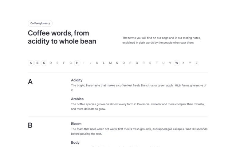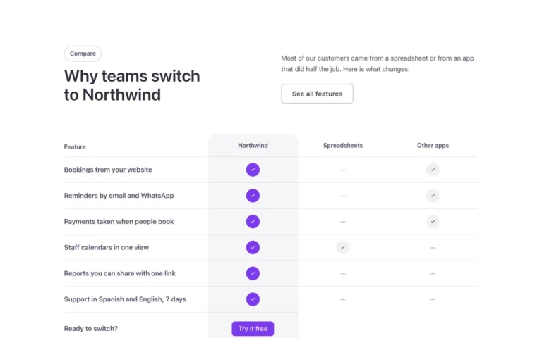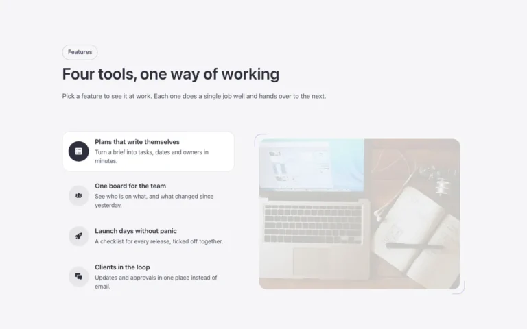
Features · Check groups
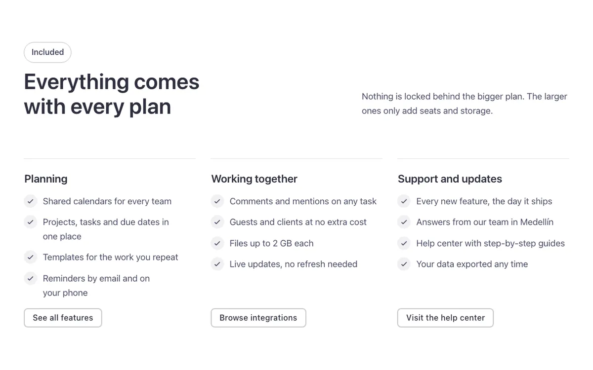
A features section for Bricks Builder with three groups side by side, each with a thin line on top, a title, a check list and a small button aligned on the same line. On hover, the line fills with the brand color, a clear way to show everything a plan or product includes, grouped by topic.
In the annual plan, $99/year. See plans
Preview
Loading demo…
Template details
What’s inside
The components it’s built from. They come with the template when you paste it, and you edit them from the Bricks panel.
- FBK Button
A link styled as a button, with style, size and width.
- FBK Check item
One row of an FBK Check list: the house check mark and a short text.
- FBK Check list
A list of checks in the Fancy Bricks style families.
- FBK Icon item
Icon, title and text, stacked, inline or boxed.
- FBK Intro
Eyebrow, title, lead and an actions slot for buttons.
Adjust it
Change these variables in Bricks to tune it; everything else follows your framework.
On the element Groups, class fbk-checkgroups
Line above each group
- --fbk-t-line
- color-mix(in srgb, currentColor 16%, transparent)
- --fbk-t-time
- var(--fbk-hover)