Cards · Central card
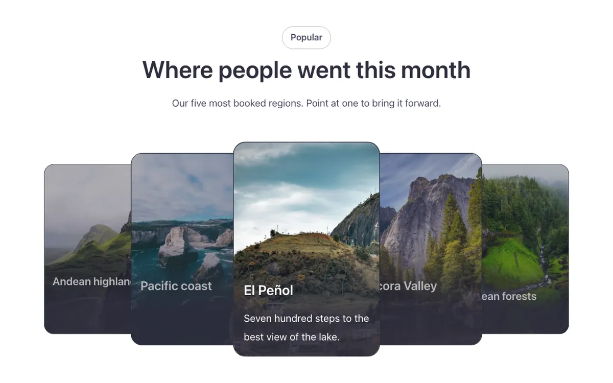
A cards layout for Bricks Builder with photo cards overlapping in a pyramid around one large card in the center. Point at any of the surrounding cards and it comes forward to the center. Good for a compact, interactive way to show a handful of photos.
In the annual plan, $99/year. See plans
Preview
Loading demo…
Template details
What’s inside
The components it’s built from. They come with the template when you paste it, and you edit them from the Bricks panel.
Adjust it
Change these variables in Bricks to tune it; everything else follows your framework.
On the element Central card row, class fbk-cardscover
Card size, overlap in the pyramid, and the active card's size
- --fbk-t-width
- 13em
- --fbk-t-height
- 19em
- --fbk-t-overlap
- 3em
- --fbk-t-active
- 1.15
Photo zoom of fbk-cardscover--zoom: the original's strong zoom (1.2), in proportion to --fbk-zoom (1.05)
- --fbk-t-zoom
- calc(1 + (var(--fbk-zoom) - 1) * 4)
One hover duration for the whole library (--fbk-hover, Fancy Bricks knob)
- --fbk-t-time
- var(--fbk-hover)
Replaces
In Fancy Bricks 1.0 and 2.0 this was Central card (2.0).