Testimonials · Photo carousel
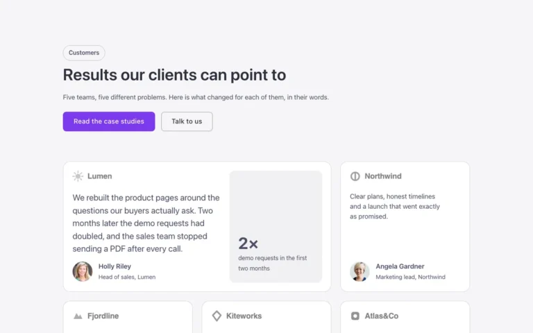
A testimonials section for Bricks Builder with a darkened photo and headline on one side and a quote carousel on the other, the center quote full size with the neighbors peeking smaller at the edges. Built on the FBK Quote component, it autoplays with a shared pause button for WCAG 2.2.2.
In the annual plan, $99/year. See plans
Uses a small script. Turn on Code execution in Bricks › Settings › Custom code. How to turn on Code execution
Preview

Loading demo…
Template details
What’s inside
The components it’s built from. They come with the template when you paste it, and you edit them from the Bricks panel.
Adjust it
Change these variables in Bricks to tune it; everything else follows your framework.
On the element Photo + carousel, class fbk-photo-quotes
Side quotes: size and fade (95 % or more keeps their text readable)
- --fbk-t-side-scale
- 0.9
- --fbk-t-side-opacity
- 0.9
The brand band behind the top of the quotes
- --fbk-t-band
- var(--primary)
- --fbk-t-band-height
- 45%
The pause button's ring track: light, it sits on the dark photo
- --fbk-slider-track
- var(--white)
Layout: photo | carousel (one column on phones)
- --fbk-t-columns
- minmax(0, 1fr) minmax(0, 2fr)
Replaces
In Fancy Bricks 1.0 and 2.0 this was Testimonial (1.0).