
FBK Team member
A person’s photo, name, role, bio and a slot for social links.
- Used in 11 templates
- 19 options
- Native Bricks element
One FBK Team member, as in the first example below. Change anything from the panel after you paste it.
In the annual plan, $99/year. See plans
Every FBK Team member variation
Live from the demo site. Switch the width and the background, or open it full screen.

Loading demo…
The options
Every property of the component, in the order the Bricks panel shows them.
| Option | Choices | Default |
|---|---|---|
| PhotoA portrait, at least 640 px wide. It is decoration (the name says who it is). | Any image | — |
| Name | Any text | Sofia Marino |
| Name tagH3 inside a section with an H2 title. | H3, H4, p | H3 |
| Role | Any text | Head of design |
| Bio | Any text | — |
| Hide role | On or off | Off |
| Hide bio | On or off | Off |
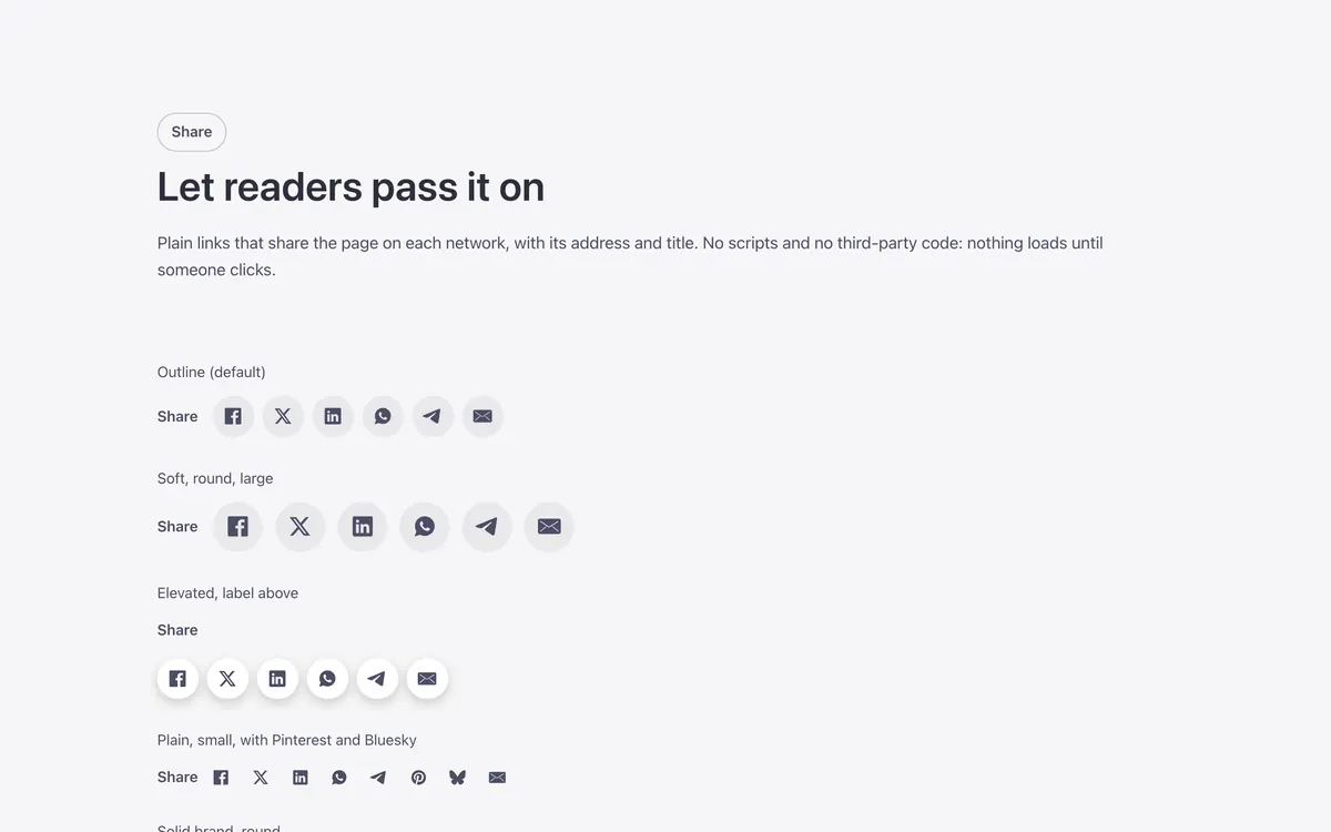
| LookPlain: no box. Soft: a tinted box that fills on hover. Outline: a thin edge that fills on hover. Solid: filled. Elevated: a raised surface with a small shadow. The same looks as every Fancy Bricks component (and the buttons: Ghost, Secondary, Outline, Primary). | Plain, Soft, Outline, Solid, Elevated | Outline |
| ToneBrand: your accent color. Neutral: the text color around it. White: the same on every background, for controls over photos. | Brand, Neutral, White | Neutral |
| ShapeRounded and Square follow your site radius. | Rounded, Square | Rounded |
| LayoutOverlay: the text on the photo. Brand foot: the text on a brand panel under the photo. Look Plain with Classic or Horizontal: no surface, the text under the photo. | Classic, Overlay, Horizontal, Brand foot | Classic |
| Photo proportionAuto: 4:5 (3:4 in Overlay). Round: a circle, as wide as --fbk-member-avatar (the card width if not set); best with Look Plain. | Auto, 1:1, 3:4, Round (avatar) | Auto |
| Alignment | Left, Center | Left |
| Photo zoom on hover | None, Zoom in, Zoom in and blur | None |
| Card on hoverGrow: the card grows a little, casts a shadow and comes to the front. Color slides in: the brand color sweeps in behind the text, which turns white (made for Horizontal). Also with keyboard focus. | Still, Grow, Color slides in | Still |
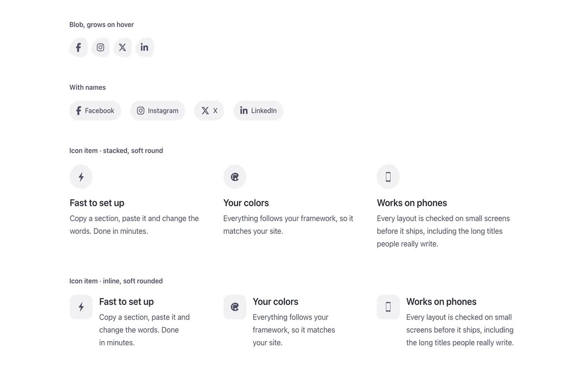
| Social linksOn hover: they come in when the card is hovered or focused (always on touch screens). | Always, On hover | Always |
| BioOver the photo on hover: the bio covers the photo when the card is hovered or focused (keep the social links, they let keyboard users focus it). Always under the name on touch screens. | Under the name, Over the photo on hover, Rises over the photo on hover | Under the name |
| HTML tagli when the members are inside a list (ul). | div, li, article | div |
| BackgroundDark or Brand when the card sits on a dark or brand background you made. | Auto, Light, Dark, Brand | Auto |
Used in 11 templates
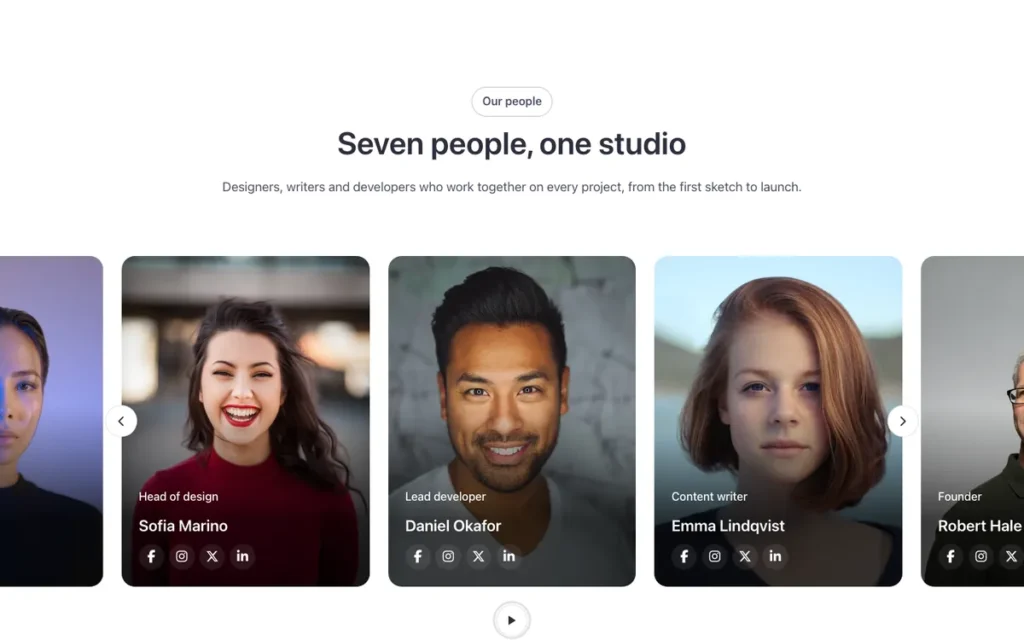
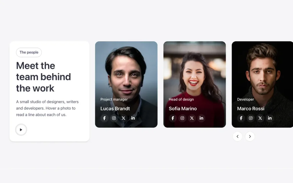
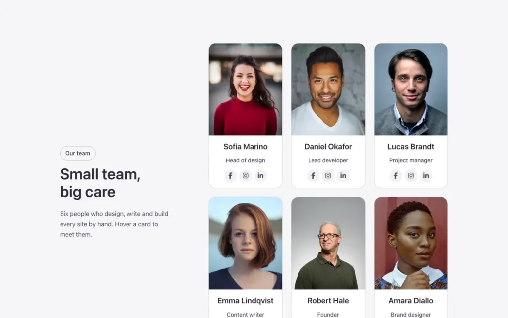
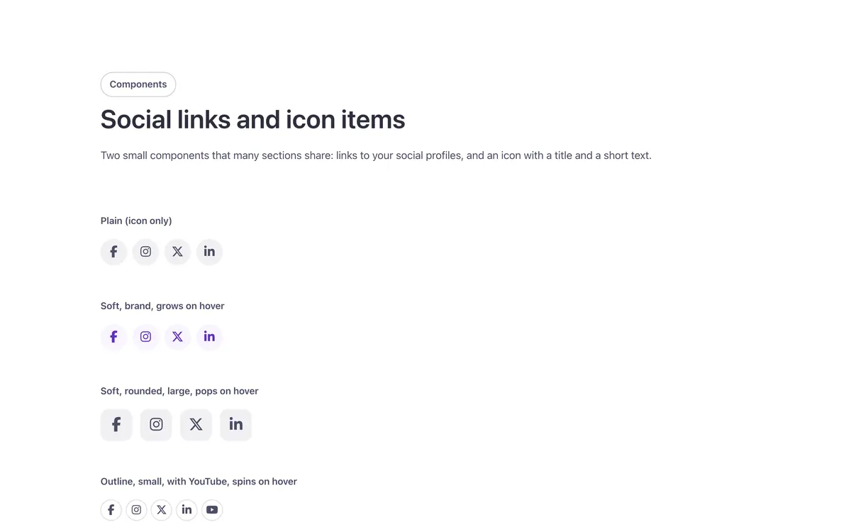
A few of them. Change FBK Team member once on your site and every one of these sections follows.



Questions, answered
Short answers about FBK Team member.
Do I need a template to use FBK Team member?
No. Copy it from this page and paste it anywhere in Bricks. It also comes with every template that uses it.
What happens if I change FBK Team member on my site?
Every instance follows: the design lives in the component and its classes, not in each copy.
Does it work with my framework?
Yes. Copy it for Fancy Framework, Automatic.css or Core Framework, and it uses your colors and sizes.
Every component comes inside a template
Browse the library, copy a section, and the components it uses come with it.