Text · Legal page
A legal page (privacy or terms): the last update, a table of contents and numbered sections with their text.
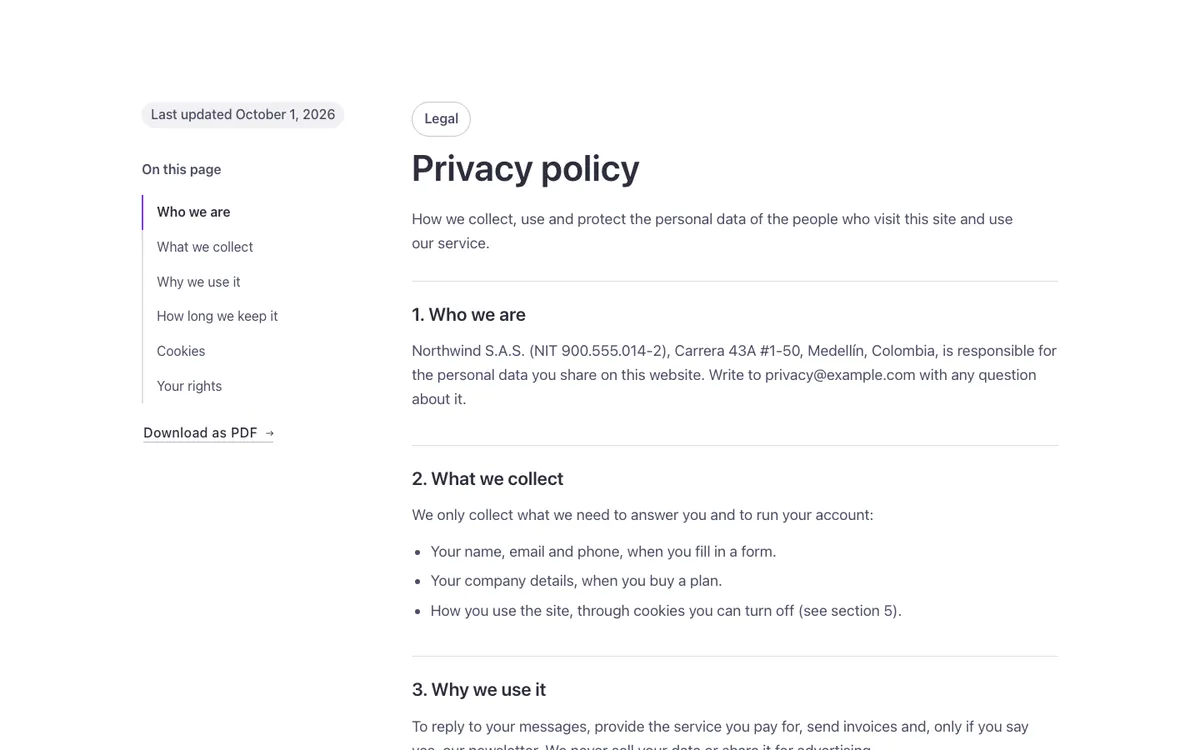
See it live: Text · Legal page on fancybricks.co — the live preview, and the button that copies it.
Or open the preview on its own — narrow the window to see it on a phone — and in dark mode.
Structure
This is what the Bricks Structure panel shows after you paste the template. Component instances say which component they are.
Text · Legal page
  Container
    Legal page
      Side
        Updated
        Contents · Label
        Contents
        Download   (FBK Button)
      Main
        Intro   (FBK Intro)
        Legal text
The template also pastes a dashed note above the section, with the short version of this page. It only shows inside the builder, never on the published page — see Builder notes.
How to adjust
Every step is the same move: pick the element in the Structure panel, change its Properties.
How to adjust a template shows every one of them in a screenshot of the real builder: the Structure and Properties panels, the classes on an element, a component's style families and the field where a CSS variable goes.
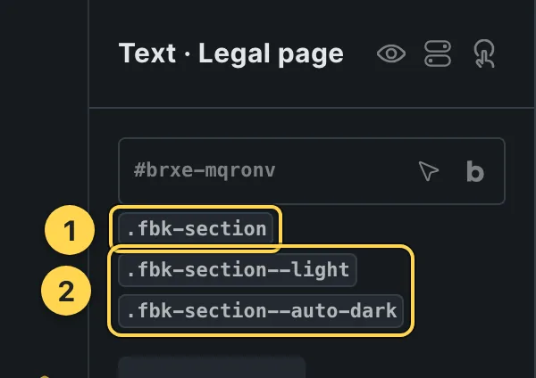
The classes this element carries, in the Bricks panel.
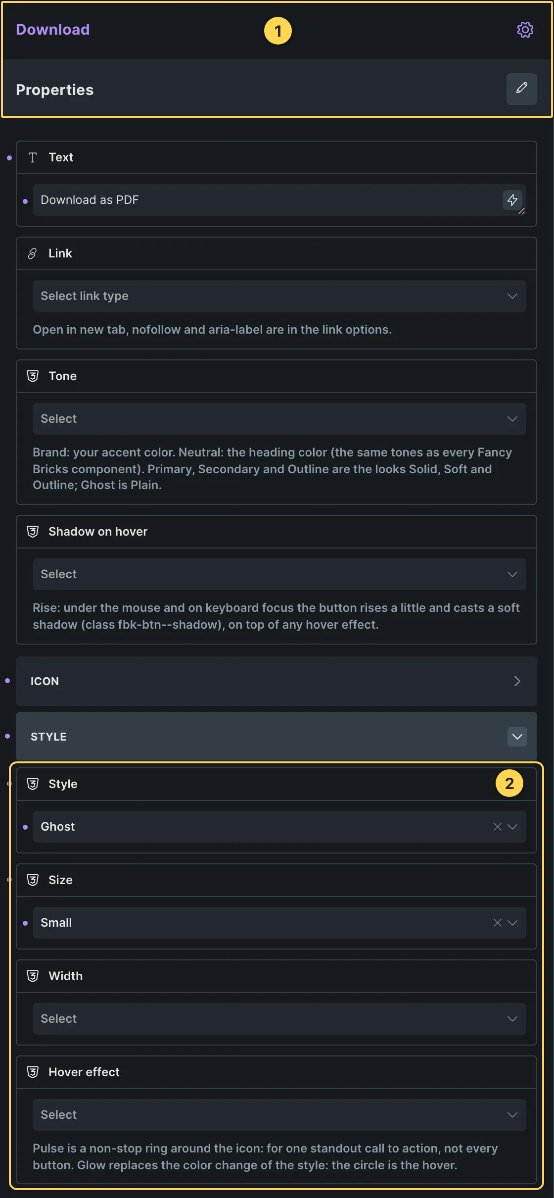
This template's own component, with its Style group open.
- Paste the template in Bricks first — see Copy and paste.
- Select Download (FBK Button) › Properties: Text, Link, Tone, Shadow on hover · Icon group: Icon, Icon position · Style group: Style, Size, Width, Hover effect.
- Select Intro (FBK Intro) › Properties: Eyebrow, Hide eyebrow, Title, Title level, Lead, Hide lead · Style group: Eyebrow style, Highlight, Title size, Accent line · Layout group: Alignment, Layout, Background, Spacing · Motion group: Reveal in slider.
- Select Contents › Content › Content selector and Headings.
Finish by hand
- Write the policy in the Legal text Rich Text: one h3 per section, without numbers
(they are added by CSS counters on
.fbk-wf-legal__content), then paragraphs and lists. Placeholder demo text: have your own policy written or checked by a lawyer. - Contents: the Bricks Table of contents element reads the h3 of
.fbk-wf-legal__contentand marks the section being read (class is-active-link: bold, heading ink and a brand line). On tablets and phones the side column sits above the text and stops staying in view. - Update the date in Updated every time you change the text; link Download as PDF to a PDF of it.
- Motion: the contents links change ink and line on hover; the Ghost button draws its line.
On phones
The template is designed desktop first, the Bricks default, and only changes at the two widths the library uses:
- 991px and below —
.fbk-wf-legal,.fbk-wf-legal__side,.fbk-intro. - 767px and below —
.fbk-section.
Those changes live in Bricks' own breakpoint fields, so you edit them where you always do: pick the breakpoint in the toolbar and the same fields follow.
Careful with the classes shared by the whole library (fbk-section, fbk-intro, the
component classes): a change there shows up in every template that uses them.
If your site's breakpoints are set up mobile first, copy the mobile-first variant of the template instead — see Copy and paste.
Accessibility
In this template, keyboard focus is visible on every interactive piece; movement is cut back when the visitor's system asks for less motion.
What is checked on every template, and what depends on your own palette: Accessibility.
Dark mode
With your site in dark mode this section turns dark too — the class fbk-section--auto-dark
on the section does it. Remove the class to keep it light.
Its background is a modifier on the section, so you can swap it for any of the ones the
template is checked with: fbk-section--light, fbk-section--soft, fbk-section--dark.
How the library follows your site's color scheme: Dark mode and preview.