Hero · Orbit (ellipse)
The intro beside a circle of photos laid down in 3D: they turn in an ellipse, always facing you, and grow as they pass in front.
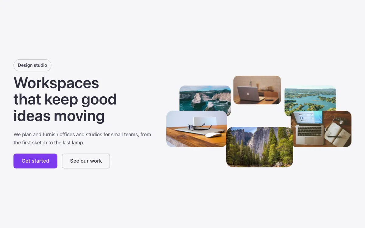
See it live: Hero · Orbit (ellipse) on fancybricks.co — the live preview, and the button that copies it.
Or open the preview on its own — narrow the window to see it on a phone — and in dark mode.
Preview on the front end. Scripts don't run inside the builder, so here you only see the layout: the photos do not turn here and the pause button is hidden (the builder does not run the code). Save and open the page to see the full result.
Structure
This is what the Bricks Structure panel shows after you paste the template. Component instances say which component they are.
Hero · Orbit ellipse
  Brand slot (decorative, empty)
  Container
    Intro   (FBK Intro)
      Button · Primary   (FBK Button)
      Button · Outline   (FBK Button)
    Orbit
      Orbit · Ring
        Orbit · Photo (decorative)
        Orbit · Photo (decorative)
        Orbit · Photo (decorative)
        Orbit · Photo (decorative)
        Orbit · Photo (decorative)
        Orbit · Photo (decorative)
      Pause button
        Toggle · Pause icon
        Toggle · Play icon
      Motion · Pause script (needs Execute code)
The template also pastes a dashed note above the section, with the short version of this page. It only shows inside the builder, never on the published page — see Builder notes.
How to adjust
Every step is the same move: pick the element in the Structure panel, change its Properties.
How to adjust a template shows every one of them in a screenshot of the real builder: the Structure and Properties panels, the classes on an element, a component's style families and the field where a CSS variable goes.
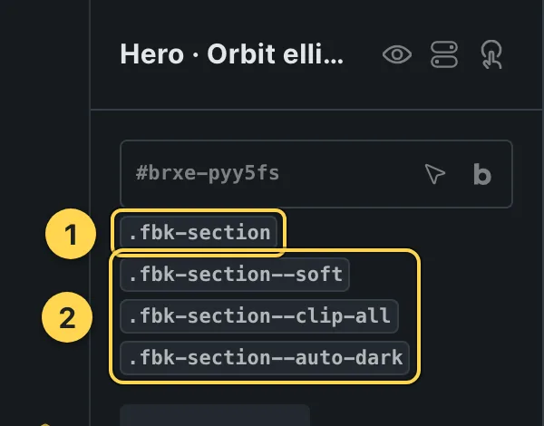
The classes this element carries, in the Bricks panel.
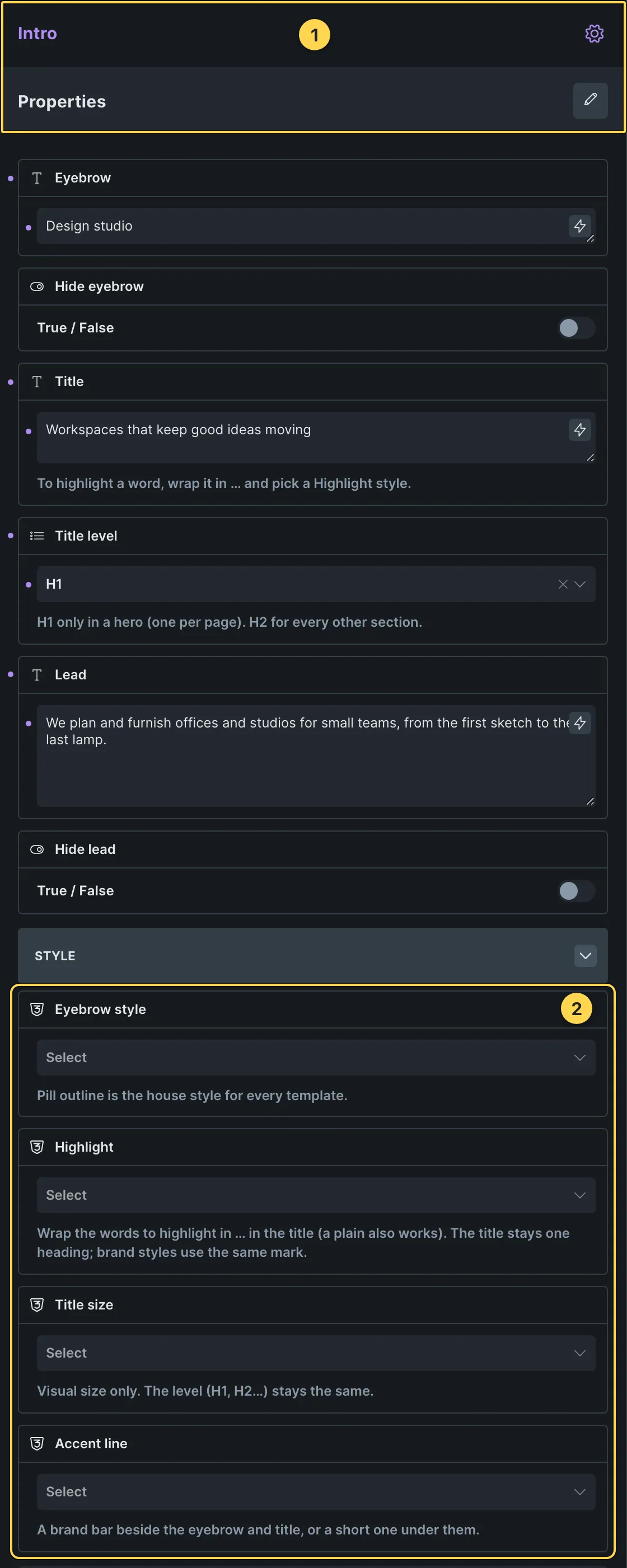
This template's own component, with its Style group open.
- Paste the template in Bricks first — see Copy and paste.
- Select Intro (FBK Intro) › Properties: Eyebrow, Hide eyebrow, Title, Title level, Lead, Hide lead · Style group: Eyebrow style, Highlight, Title size, Accent line · Layout group: Alignment, Layout, Background, Spacing · Motion group: Reveal in slider.
- Select Button · Primary, Button · Outline (FBK Button) › Properties: Text, Link, Tone, Shadow on hover · Icon group: Icon, Icon position · Style group: Style, Size, Width, Hover effect.
- Spacing, sizes, color and timing with no property of their own: the CSS variables below.
CSS variables
These are the only values in the template meant to be changed by hand. Copy the block, paste it, edit the numbers.
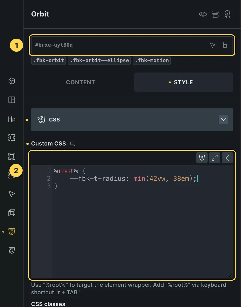
The Custom CSS field of this template's own element, with one of its variables as a real example.
/* «Orbit» · class .fbk-orbit */
.fbk-orbit {
  --fbk-t-radius: min(42vw, 38em);
  --fbk-t-item: calc(var(--fbk-t-radius) * 6.2832 / var(--fbk-orbit-n) * 0.82);
  --fbk-t-time: 70s;
  --fbk-t-height: 26em;
  /* Depth of the 3D view (ellipse) */
  --fbk-t-depth: 120em;
  --fbk-orbit-n: 10;
  /* where the center of the circle sits (from the stage's top) and how far it
     lies down (0: flat, facing you) */
  --fbk-orbit-cy: calc(var(--fbk-t-radius) + var(--fbk-t-item) * 0.5);
  --fbk-orbit-tilt: 0deg;
  --fbk-orbit-cx: 50%;
}
Paste the block in the element's Style → CSS field (the selector is already in it), or set the same variables on the class itself to change every copy at once. The values are your framework's variables, so they follow your site: Choosing a framework.
Requirements
- Code execution. Needs "Execute code" enabled for the role in Bricks → Settings → Custom code, or the JS block shows as plain text instead of running.
What each requirement is, and how to set it up once for the whole site: Requirements.
Finish by hand
- Four to twelve photos in the ring: each finds its place by itself. They are decoration (alt empty).
- Size of the circle, photo width, time for a turn and height of the stage:
--fbk-t-radius,--fbk-t-item,--fbk-t-timeand--fbk-t-heighton.fbk-orbit(the ellipse sets its own in.fbk-orbit--ellipse). - The turn is in
.fbk-orbit__ring; each photo's place in.fbk-orbit__item(Style > CSS). The pause button is required while they turn (WCAG 2.2.2); it needs "Execute code". - Button hover: the FBK Button effect Sweep (Hover effect dropdown; Color change for a plain one).
On phones
The template is designed desktop first, the Bricks default, and only changes at the two widths the library uses:
- 991px and below —
.fbk-intro. - 767px and below —
.fbk-orbit,.fbk-orbit--ellipse,.fbk-section.
Those changes live in Bricks' own breakpoint fields, so you edit them where you always do: pick the breakpoint in the toolbar and the same fields follow.
Careful with the classes shared by the whole library (fbk-section, fbk-intro, the
component classes): a change there shows up in every template that uses them.
If your site's breakpoints are set up mobile first, copy the mobile-first variant of the template instead — see Copy and paste.
Accessibility
In this template, keyboard focus is visible on every interactive piece; movement is cut back
when the visitor's system asks for less motion; the state screen readers need is already set
(aria-hidden, aria-label).
What is checked on every template, and what depends on your own palette: Accessibility.
Dark mode
With your site in dark mode this section turns dark too — the class fbk-section--auto-dark
on the section does it. Remove the class to keep it light.
Its background is a modifier on the section, so you can swap it for any of the ones the
template is checked with: fbk-section--soft, fbk-section--light, fbk-section--dark.
How the library follows your site's color scheme: Dark mode and preview.
Replaces
- Hero infinite ellipse images from Fancy Bricks 2.0
What happened to the old libraries, and what to do with pages already built with them: Migrating from 1.0/2.0.