Gallery · Show all photos
The Bricks Image Gallery as one large photo and four small ones; the rest wait in the lightbox and a Show all photos (+N) pill counts them.
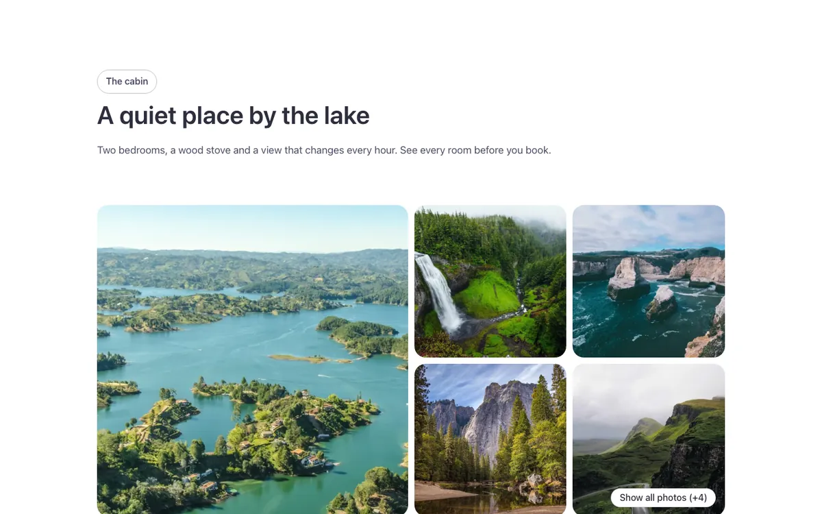
See it live: Gallery · Show all photos on fancybricks.co — the live preview, and the button that copies it.
Or open the preview on its own — narrow the window to see it on a phone — and in dark mode.
Structure
This is what the Bricks Structure panel shows after you paste the template. Component instances say which component they are.
Show-all gallery
  Container
    Intro   (FBK Intro)
    Gallery
The template also pastes a dashed note above the section, with the short version of this page. It only shows inside the builder, never on the published page — see Builder notes.
How to adjust
Every step is the same move: pick the element in the Structure panel, change its Properties.
How to adjust a template shows every one of them in a screenshot of the real builder: the Structure and Properties panels, the classes on an element, a component's style families and the field where a CSS variable goes.
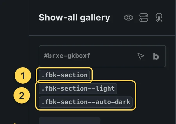
The classes this element carries, in the Bricks panel.

This template's own component, with its Style group open.
- Paste the template in Bricks first — see Copy and paste.
- Select Intro (FBK Intro) › Properties: Eyebrow, Hide eyebrow, Title, Title level, Lead, Hide lead · Style group: Eyebrow style, Highlight, Title size, Accent line · Layout group: Alignment, Layout, Background, Spacing · Motion group: Reveal in slider.
- Select Gallery › Content › Items: pick your photos in the media library.
Finish by hand
- Photos: select the Gallery element and pick them in Items from the media library (their alt text comes from there). Add as many as you like: the ones that don't fit are counted by the pill and browse in the lightbox.
- One large photo and four small ones; from the 6th on they are hidden and counted (on
phones, one wide and two small): the rules are in class
.fbk-showall(Style > CSS). Columns, spacing and proportion are the gallery's own controls. - Pill: class
fbk-gallery--moreon Gallery. It is the Fancy Bricks control over a photo (Solid · White · Round: classesfbk-ui,fbk-ui--solid,fbk-ui--light,fbk-ui--roundon Gallery); its text and colors are--fbk-gallery-more-label,--fbk-gallery-more-bgand--fbk-gallery-more-color(set them on.fbk-showall). A click on it opens the photo under it in the lightbox. - Hover: a thin + over a dimmed, slightly blurred photo (
fbk-gallery--plus) and a soft zoom (fbk-gallery--zoom); remove either class to turn it off.
On phones
The template is designed desktop first, the Bricks default, and only changes at the two widths the library uses:
- 991px and below —
.fbk-intro. - 767px and below — Gallery,
.fbk-showall,.fbk-section.
Those changes live in Bricks' own breakpoint fields, so you edit them where you always do: pick the breakpoint in the toolbar and the same fields follow.
Careful with the classes shared by the whole library (fbk-section, fbk-intro, the
component classes): a change there shows up in every template that uses them.
If your site's breakpoints are set up mobile first, copy the mobile-first variant of the template instead — see Copy and paste.
Accessibility
In this template, keyboard focus is visible on every interactive piece; movement is cut back when the visitor's system asks for less motion.
What is checked on every template, and what depends on your own palette: Accessibility.
Dark mode
With your site in dark mode this section turns dark too — the class fbk-section--auto-dark
on the section does it. Remove the class to keep it light.
Its background is a modifier on the section, so you can swap it for any of the ones the
template is checked with: fbk-section--light, fbk-section--soft, fbk-section--dark.
How the library follows your site's color scheme: Dark mode and preview.
Replaces
- Airbnb Gallery from Fancy Bricks 2.0
What happened to the old libraries, and what to do with pages already built with them: Migrating from 1.0/2.0.