Footer · Minimal
One calm line: logo, a row of links, social links, copyright and Back to top; on phones everything stacks in the center.

See it live: Footer · Minimal on fancybricks.co — the live preview, and the button that copies it.
Or open the preview on its own — narrow the window to see it on a phone — and in dark mode.
Structure
This is what the Bricks Structure panel shows after you paste the template. Component instances say which component they are.
Footer minimal
  Container
    Footer
      Logo
      Menu   (FBK Link list)
        Links · Menu Footer
      Social   (FBK Social)
      Copyright and top
        Copyright
        Back to top
          Top · Text
          Top · Arrow
The template also pastes a dashed note above the section, with the short version of this page. It only shows inside the builder, never on the published page — see Builder notes.
How to adjust
Every step is the same move: pick the element in the Structure panel, change its Properties.
How to adjust a template shows every one of them in a screenshot of the real builder: the Structure and Properties panels, the classes on an element, a component's style families and the field where a CSS variable goes.
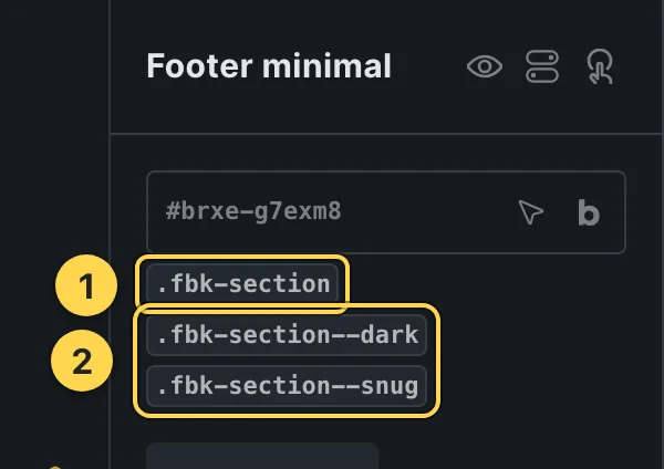
The classes this element carries, in the Bricks panel.
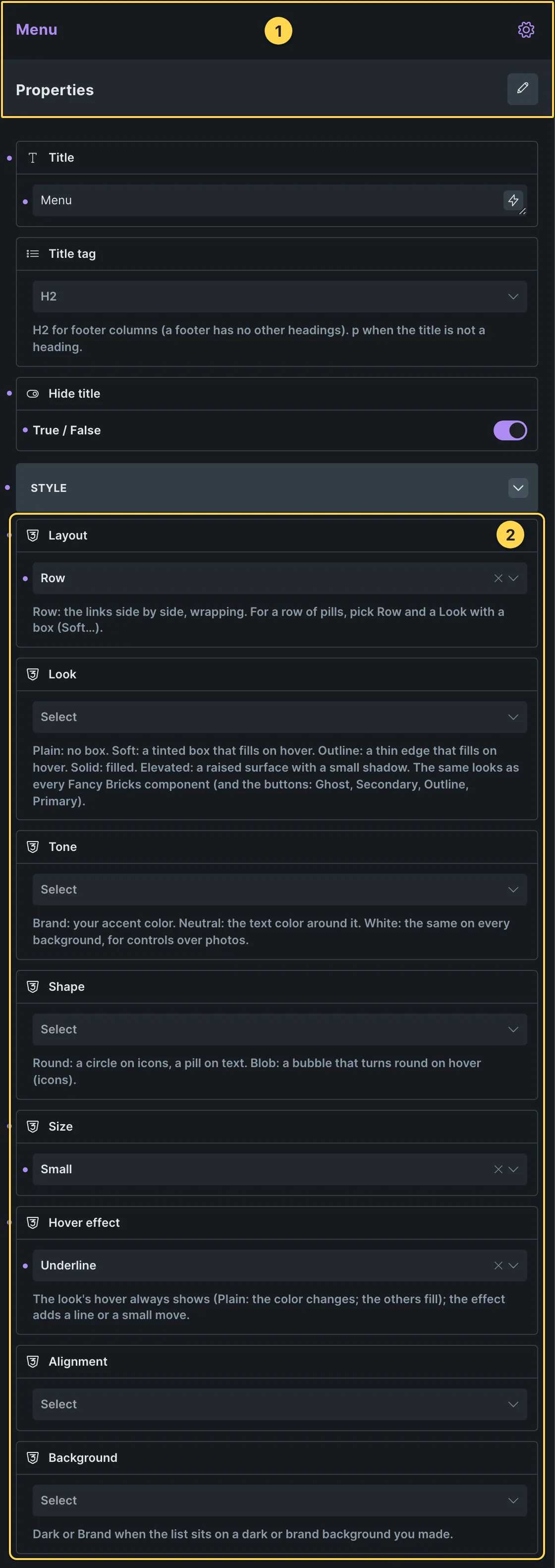
This template's own component, with its Style group open.
- Paste the template in Bricks first — see Copy and paste.
- Select Menu (FBK Link list) › Properties: Title, Title tag, Hide title · Style group: Layout, Look, Tone, Shape, Size, Hover effect, Alignment, Background.
- Select Social (FBK Social) › Properties: Networks group: Facebook link, Instagram link, X link, LinkedIn link, YouTube link, TikTok link, Hide Facebook, Hide Instagram, Hide X, Hide LinkedIn, Hide YouTube, Hide TikTok · Style group: Look, Tone, Shape, Size, Show names, Hover effect, Background.
- Select Logo › Content › Logo: your site logo (or Settings › Theme Styles › Logo).
- Select Links · Menu Footer › Content › Menu: pick your WordPress menu (Appearance › Menus).
Finish by hand
- Logo: set your image in the Logo element; the text Northwind shows only while there is no image.
- Menu: a Bricks Nav Menu with a WordPress menu (in the Links slot of the FBK Link list): pick your menu in its settings (Menu). Keep it short (four or five links) so the footer stays on one line.
- This is a Footer template: set where it shows in Template settings → Conditions (for
example, the entire website). Light footer: change
fbk-section--darktofbk-section--lighton the section. - Back to top links to #; point it to an id at the top of your page if you prefer.
Its arrow rises on hover and focus: the optional class
.fbk-fminimal--lifton.fbk-fminimal(remove it for a still link). The menu underline is the FBK Link list Hover effect (Underline).
On phones
The template is designed desktop first, the Bricks default, and only changes at the two widths the library uses:
- 991px and below —
.fbk-fminimal,.fbk-fminimal__end. - 767px and below —
.fbk-fminimal,.fbk-section.
Those changes live in Bricks' own breakpoint fields, so you edit them where you always do: pick the breakpoint in the toolbar and the same fields follow.
Careful with the classes shared by the whole library (fbk-section, fbk-intro, the
component classes): a change there shows up in every template that uses them.
If your site's breakpoints are set up mobile first, copy the mobile-first variant of the template instead — see Copy and paste.
Accessibility
In this template, keyboard focus is visible on every interactive piece; movement is cut back
when the visitor's system asks for less motion; the state screen readers need is already set
(aria-hidden, aria-label).
What is checked on every template, and what depends on your own palette: Accessibility.
Dark mode
This section is dark on purpose (class fbk-section--dark), so it looks the same whether
your site is in light or dark mode.
How the library follows your site's color scheme: Dark mode and preview.