Cards · Services
Six service cards with an icon in a soft circle, a title, a short text and a Learn more foot; the whole card is a link.

See it live: Cards · Services on fancybricks.co — the live preview, and the button that copies it.
Or open the preview on its own — narrow the window to see it on a phone — and in dark mode.
Structure
This is what the Bricks Structure panel shows after you paste the template. Component instances say which component they are.
Cards · Services
  Container
    Intro   (FBK Intro)
    Services
      Card grid   (FBK Card grid)
        Card · Brand identity   (FBK Card)
          Card · Icon box
            Card · Icon
          Foot (decorative)
            Foot · Text
            Foot · Arrow
        Card · Website design   (FBK Card)
          Card · Icon box
            Card · Icon
          Foot (decorative)
            Foot · Text
            Foot · Arrow
        Card · Online shops   (FBK Card)
          Card · Icon box
            Card · Icon
          Foot (decorative)
            Foot · Text
            Foot · Arrow
        Card · Search and content   (FBK Card)
          Card · Icon box
            Card · Icon
          Foot (decorative)
            Foot · Text
            Foot · Arrow
        Card · Photo and video   (FBK Card)
          Card · Icon box
            Card · Icon
          Foot (decorative)
            Foot · Text
            Foot · Arrow
        Card · Care plans   (FBK Card)
          Card · Icon box
            Card · Icon
          Foot (decorative)
            Foot · Text
            Foot · Arrow
The template also pastes a dashed note above the section, with the short version of this page. It only shows inside the builder, never on the published page — see Builder notes.
How to adjust
Every step is the same move: pick the element in the Structure panel, change its Properties.
How to adjust a template shows every one of them in a screenshot of the real builder: the Structure and Properties panels, the classes on an element, a component's style families and the field where a CSS variable goes.
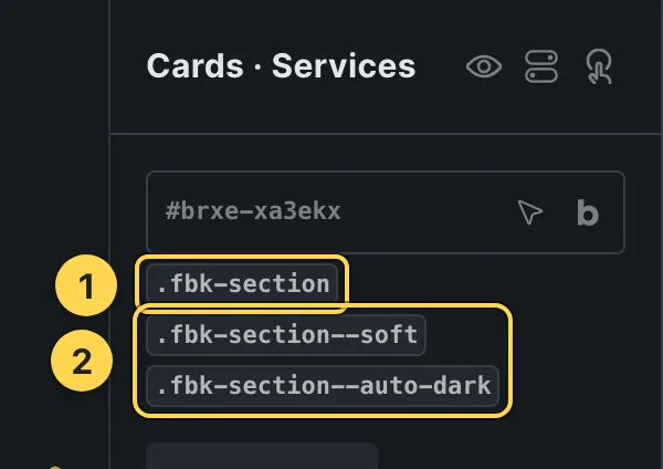
The classes this element carries, in the Bricks panel.

This template's own component, with its Style group open.
- Paste the template in Bricks first — see Copy and paste.
- Select Intro (FBK Intro) › Properties: Eyebrow, Hide eyebrow, Title, Title level, Lead, Hide lead · Style group: Eyebrow style, Highlight, Title size, Accent line · Layout group: Alignment, Layout, Background, Spacing · Motion group: Reveal in slider.
- Select Card grid (FBK Card grid) › Properties: Layout group: Columns · Hover effects group: Hover motion, Photo zoom, Photo color, Border light, Reveal text, Hide effects script.
- Select Card · Brand identity, Card · Website design, Card · Online shops (+3 more) (FBK Card) › Properties: Title, Title level, Text, Hide text · Style group: Highlight, Title size, Look, Tone, Shape, Photo overlay, Padding, Photo hover, Background · Layout group: HTML tag, Layout.
Finish by hand
- Each card is an FBK Card: its title holds the link (
<a href="…">) and the link covers the whole card. The Learn more foot is decorative (hidden from screen readers: the title already names the link). - The lift on hover is the grid's Hover motion property (Lift or None).
- The icon fill, the growing icon, the moving arrow and the underline are the class
.fbk-services--motion(Style > CSS: the states are %root%.fbk-card:hover and %root%.fbk-card:focus-within); remove it for still cards. The icon box uses the style families (Soft · Neutral · Round): change its classesfbk-ui--soft/ --neutral / --round to change the look.
On phones
The template is designed desktop first, the Bricks default, and only changes at the two widths the library uses:
- 991px and below —
.fbk-intro. - 767px and below —
.fbk-section.
Those changes live in Bricks' own breakpoint fields, so you edit them where you always do: pick the breakpoint in the toolbar and the same fields follow.
Careful with the classes shared by the whole library (fbk-section, fbk-intro, the
component classes): a change there shows up in every template that uses them.
If your site's breakpoints are set up mobile first, copy the mobile-first variant of the template instead — see Copy and paste.
Accessibility
In this template, keyboard focus is visible on every interactive piece; movement is cut back
when the visitor's system asks for less motion; the state screen readers need is already set
(aria-hidden).
What is checked on every template, and what depends on your own palette: Accessibility.
Dark mode
With your site in dark mode this section turns dark too — the class fbk-section--auto-dark
on the section does it. Remove the class to keep it light.
Its background is a modifier on the section, so you can swap it for any of the ones the
template is checked with: fbk-section--soft, fbk-section--light, fbk-section--dark.
How the library follows your site's color scheme: Dark mode and preview.